Blue System – Bringing structure and clarity to an existing internal HR platform
Redesigning an internal HR self-service platform used by employees to manage working hours, time-off requests, documents and ongoing HR cases.
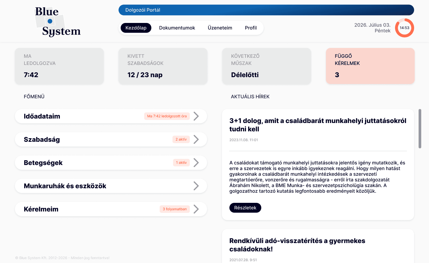
Challenge
The platform had grown organically without a redesign for more than 10 years, resulting in an inconsistent visual language and a navigation structure that made everyday tasks harder to find.
My goal was to create a clearer and more coherent experience by improving the existing structure and interface, without introducing new functionality at this stage.
Results
This phase of the redesign is complete: the platform has a visual identity of its own again, a navigation structure reorganised around how people actually use it rather than how it happened to grow, and a consistent set of components and micro-interactions to build the rest on.
What you see here is the employee-facing experience. The superior and admin views are next, followed by another round of testing and a matching app redesign. This case study will keep growing as those pieces come together.
Starting pain point
The platform's branding was originally part of another company's product suite. It later moved to a different company, and as a result the login screen and in-app header still prominently displayed the other company's logo.
At the same time, the interface had accumulated inconsistencies in layout, components, colours and information structure, and wore an overall "old-time" style, as if time had stopped.
These issues became the starting point for the redesign.
Research & Insights
Understanding the platform and its users
Before redesigning the interface, I looked at how similar workforce-management platforms approach their employee-facing experiences. I compared Nexon, Shiftbase, Clockin and Planday, focusing on self-service, scheduling, mobile access, offline functionality and HR-related features. This helped me understand both common patterns and opportunities for improvement within the existing platform.
To complement the competitive research, I also spoke with an HR professional who works with similar tools every day. Their experience helped me distinguish between features that would simply be nice to have and issues that actually create friction in everyday use.
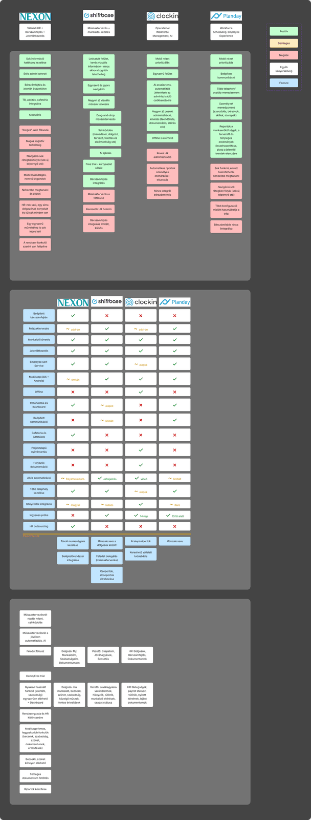
- 1. Collecting insightsThe positive and negative insights from each platform.
- 2. Feature tableWhat is available on which platform, to see clearly what is basic or more advanced, and how the platform can be "different".
- 3. FocusTaking out the most important things to focus on in this redesign phase.
Defining the scope
The research made one thing particularly clear: the biggest problems were not necessarily caused by missing features. Many existing functions were simply difficult to find or understand.
Instead of turning the redesign into a feature wishlist, I focused this phase on making better use of what was already there. I reorganised the information architecture, explored different navigation structures, and refined the existing content without expanding the product's functionality. This created a stronger foundation for future development.
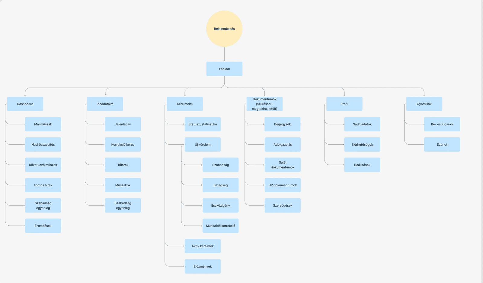
The redesign
The redesign brings the existing platform together through a more consistent visual language and clearer information hierarchy. First, the logo and colours were finalised, as these formed the base of the branding.
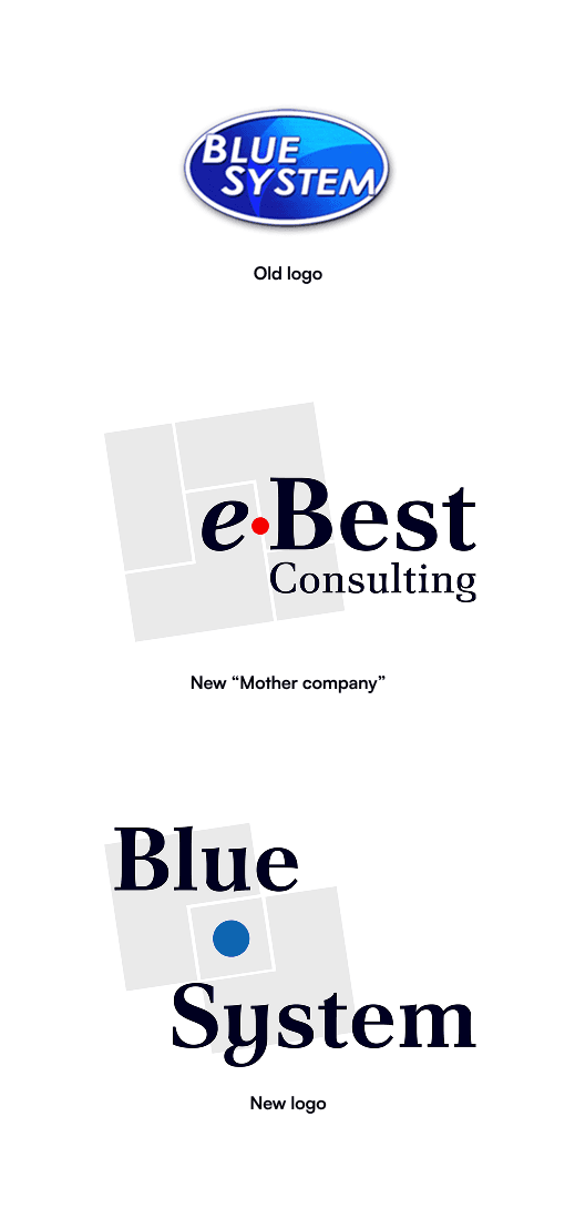

The logo phases and the brand colours used in the redesign
Next, I worked on the web platform. I made different variations of the main page and the company chose the one they felt most connected with. This became the base of the layout and main component designs.
I simplified layouts, improved the organisation of content, and introduced clearer status indicators to make important information easier to scan. The same approach was applied across dashboards, tables, forms and navigation, creating a more consistent experience while keeping the functionality familiar to existing users.
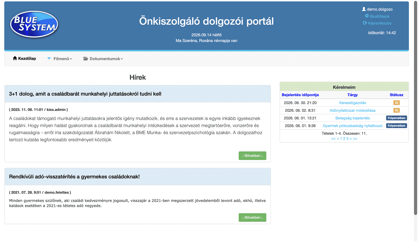
Dashboard: clearer overview and stronger hierarchy
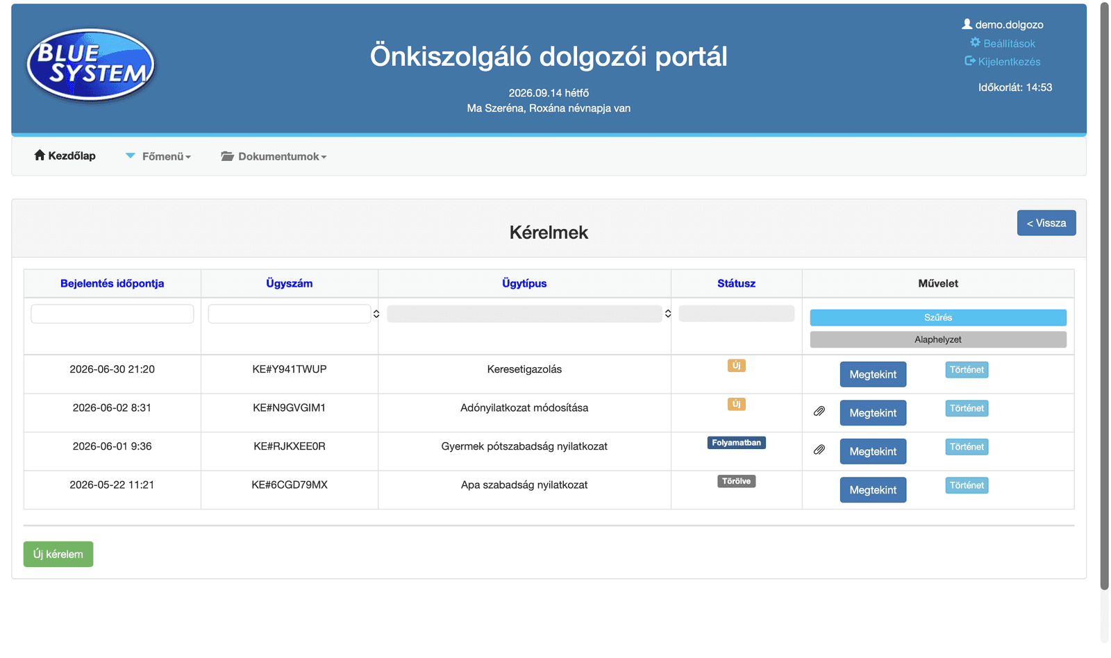
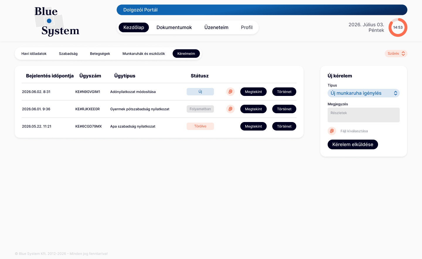
Tables: improved readability and clearer status information
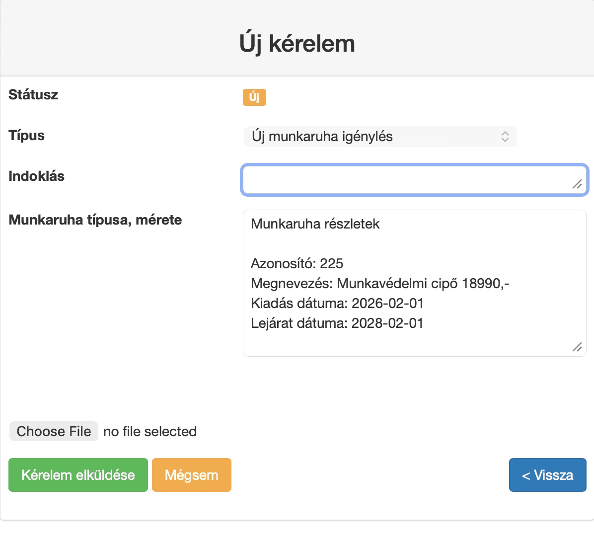
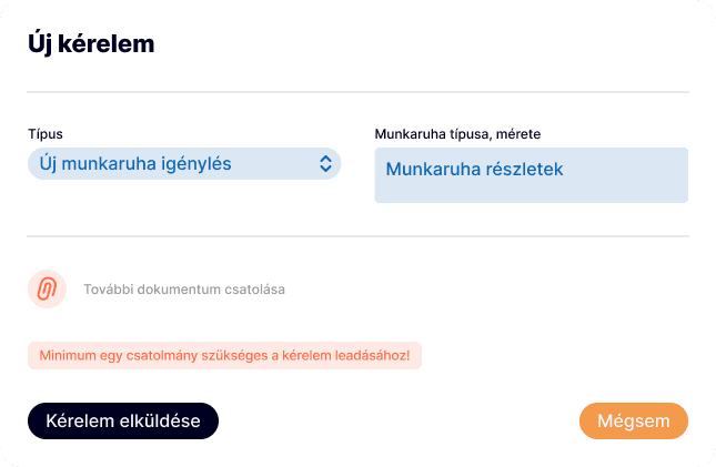
Forms: more structured fields and clearer actions
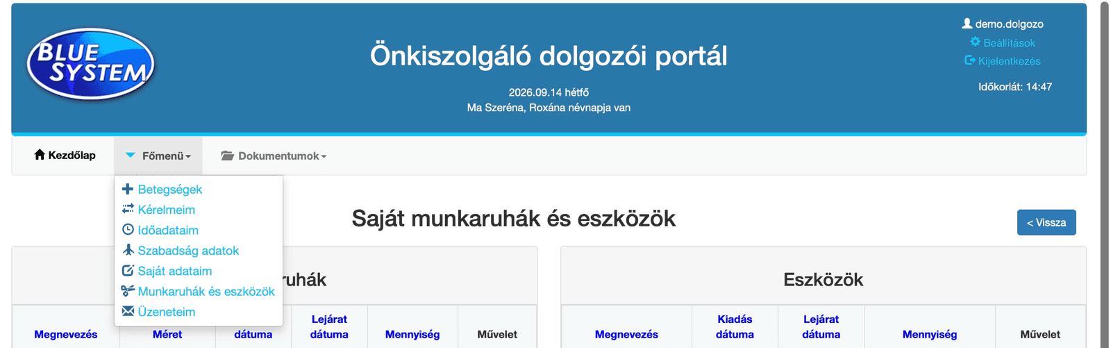

Navigation: better grouping and easier access to existing features
Micro-interactions
Alongside the larger structural changes, I focused on the smaller interactions that shape the overall experience. The current website is static, and a confirmation message giving users immediate feedback after submitting, saving, deleting or resetting information is often missing.
The navigation also received an active-state interaction to make it clearer where the user currently is within the platform. These details may be small, but they make the interface feel more responsive and give users confidence that their actions have been completed.
What's next
This phase focused on the employee-facing experience and establishing a clearer foundation for the platform.
The next steps are to redesign the superior and admin views, test the updated experience with users, and continue developing the system into a complete web experience. The same visual language will then carry over into a future mobile app redesign and the product's website.